I have gotten a few requests for a peek into our place, so I just put together a few photos from each of our rooms (when they were clean, of course! Our apartment rarely looks this nice. Haha).
I'll start out with the living room:


Here's a close up of that art on the far wall. This used to be a big empty expanse of wall, until I remembered the cheap travel prints I'd snagged last summer that were sitting in the hall closet all lonely. Popped 'em into some white Walmart frames (seen lately in our V-day decor) and buh-bye boring wall!

Here's a shot of the coffee table, which we nabbed from Ryan's house. Now that I look at the pic I'm not loving the color of the candles. Might need to change them out.

Here's the media center:
Here's the bookshelf by our entry. I clearly love lime green, blue, and orange together. Perhaps too much! Haha.

Here's a close-up of the shelf.

On to the dining room/kitchen area! This might be my favorite area (when it's clean. When it's not...ugh I hate it! Dishes are not my favorite thing, and our dishwasher is not the best so we basically have to hand wash everything). Here's an overview:


We recently added shelves and frames over the sink to make it less naked. I love our little rainbow gallery wall! The best part? The shelves and the frames were all stolen from other rooms in our house! Gotta love free decorating. Here are the links to the "Home" and "I Love Us" printables, both from the girls at eighteen25. Both come in a multitude of color combos. I'm loving the sunny yellow, clearly!


Here it is from the other angle. Just because:

Now for the bedroom. It has evolved a little since we moved in, so you might notice some changes in these pictures. (Why not take new pictures of it now, you may ask? Well, when I was taking pictures I was too lazy to make the bed. Hahaha.) Plus, the cat looks cute in this picture. Had to include it!

Here's half of the dresser (the other half holds the giant and ugly TV...no pics of that beast) and our hamper. And another art print (which was later moved and replaced with a small quatrefoil mirror).

We added a little seating area right next to the dresser. I got the chair at Pier1 and just love how well it matches the poster ( another by Suzanna Anna! Love her art.)

Here's our bathroom. As a transition picture I had to include this. I was kind of giddy when I realized that our bathroom towels and color scheme matched our bedroom so well, since eventually we'll probably have a master bath and the two rooms will need to be visually tied together. It was a completely happy accident. Please ignore my ugly hair.

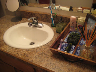
Now on to the actual bathroom:


Well, that's all for now! Hope you enjoyed this virtual tour! :)


B! It's so cute. I just love that it's all your own personal style!!
ReplyDeleteYour place is FAB.U.LOUS!!! So many cute things and I love the colors - so fresh!
ReplyDelete